![]()
![]()
![]()
![]()
![]()
![]()
![]()
![]()
![]()
![]()
![]()
![]()

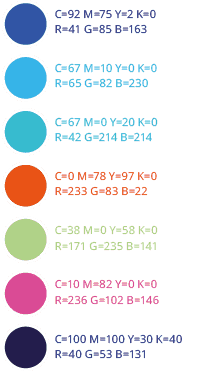
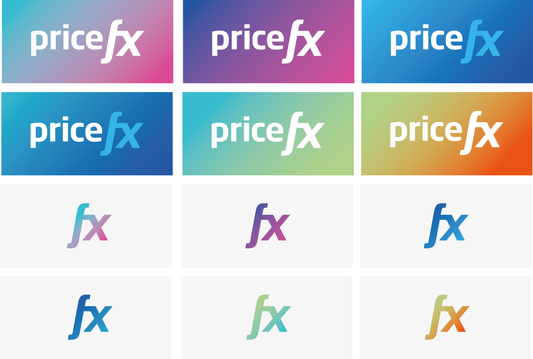
LOGO DARK VERSION


LOGO LIGHT VERSION


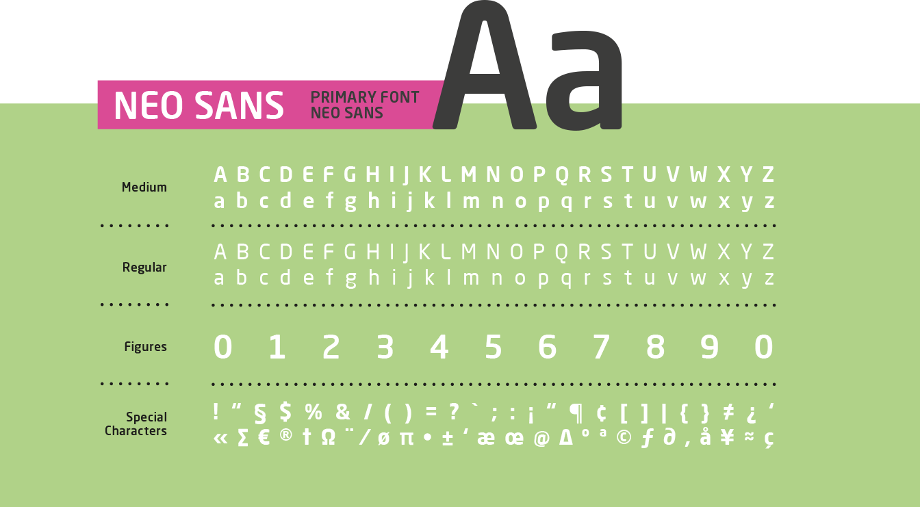
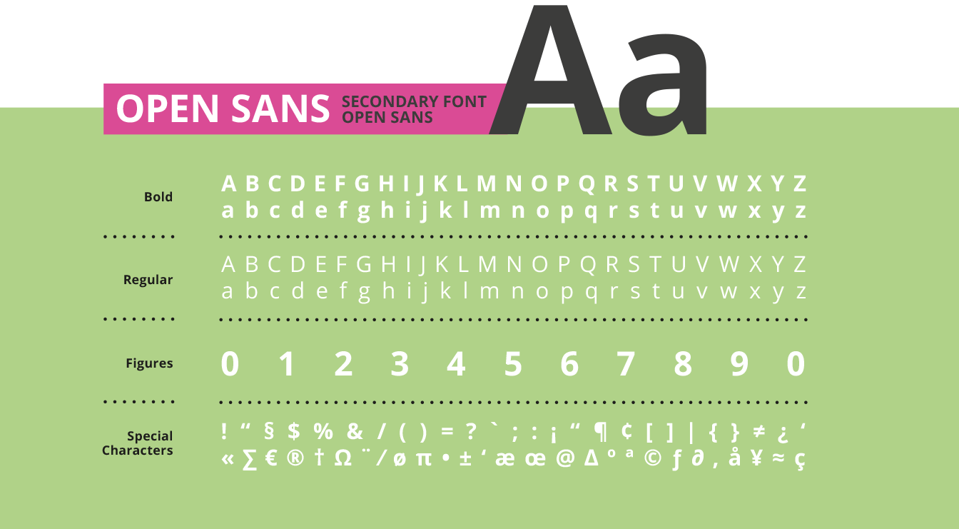
1.2
Corporate
Fonts

![]()

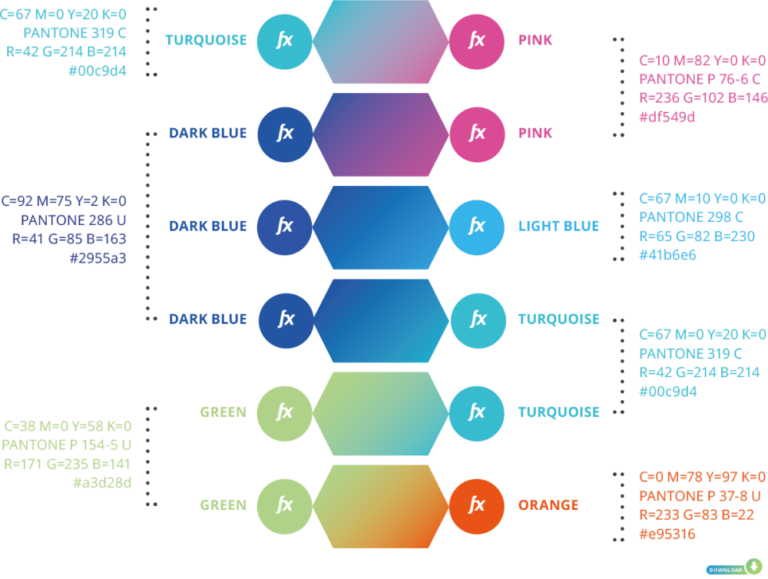
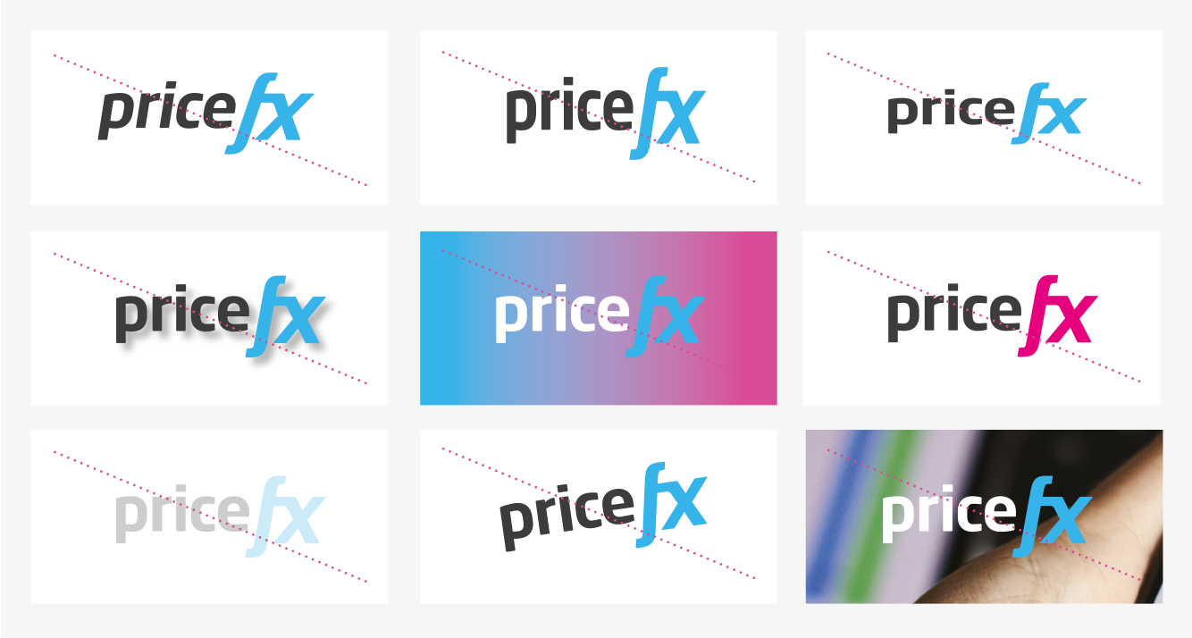
1.5 Images
and blending
modes