Today, Pricefx has grown into an global company with multiple brands. Our solutions are tailored-made for companies all over the world in various industries. And each solution has its strong logo.
Our logo is our asset and the primary visual element that identifies us. Accelerate, as Pricefx’s Pricing Conference for professionals, has its own brand and logo.
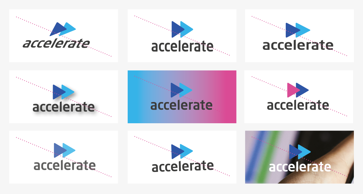
The Full Logotype
The Accelerate Logo comes in two versions: light and dark. The typeface is Open Sans and has also been chosen to compliment and balance perfectly with the logo symbol. The corporate logo is presented through the use of color as well as shape and form. It is a fresh and appealing blend of colors chosen for their strong combination – modern – classic – timeless. The colors have been selected according to international standards as shown below and are easily implemented.
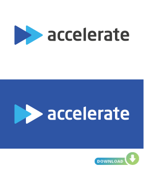
The general Logo The main logo is the dark logo used on white or colored backround. For darker backrounds you will find an alternative below.
Logo Title Carefully chosen for its modern and yet refined, highly legible style, which has been further enhanced by the use of italic letters.
Logo Symbol Logo Symbol is a powerful image leading to a successful outcome.
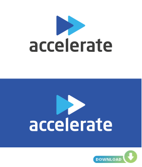
LOGO DARK VERSION
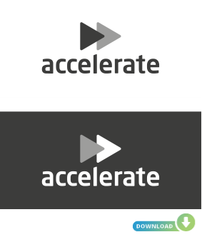
LOGO LIGHT VERSION
1) The Logo dark version will be used when the background color is light colored. 2) The Logo light versionwill be used when the background color is dark colored.
Recommended formats are:.pdf | .ai | .png | .tiff Attention:Use of any stylized, animated, hand drawn or other versions of an unofficial logo is not permitted. This undermines the logo system and brand consistency. Please consult with Pricefx Trademark Licensing if you have any questions or need further help.
Attention: A similar situation applies to logotypes
Clear Space
The clear space around the logotype allows it to stand out from surrounding elements. Clear space is proportional to the height of the logotype. Whenever possible, allow more clear space around the logotype than the minimum specified.
Application on a Background
Minimum Logo Sizes
Incorrect logo usage
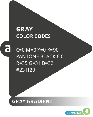
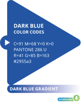
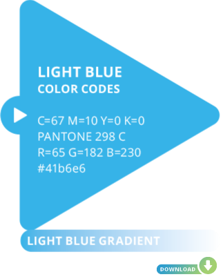
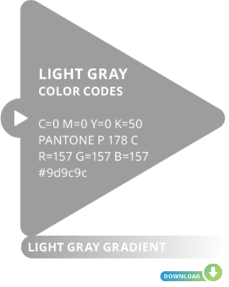
Corporate Color Palette
Explanation: The Accelerate events have four official colors. These colors have become a recognizable identifier for the brand.
Usage: Use them as the dominant color palette for all internal and external visual presentations of the company.